(Image Credits:- Indian Express/WideCare)
When it launched back in July, Nothing Phone (1) generated a lot of interest–despite being the first phone by a new brand. But hype aside, the early buyers had mixed reactions to the Phone (1). When it was first introduced, there were concerns, especially with regard to the software. But a few OTA updates later, Nothing has seemingly ironed out most major issues. So does that mean the Nothing Phone 1 is finally a better, more reliable recommendation? Well, I’ll try to answer this today. I pre-ordered and purchased the first batch of the Phone (1) in July. The phone has been my daily driver for almost three months now. Here’s my full review of the Nothing Phone 1 month later.
In this article, I will address the top questions that you may still have about the device if you’re considering buying it. Let’s begin with one of the most important aspects of the device.
Specs matter, but not as much as you probably think
I disliked the choice of the Snapdragon 778G on the Nothing Phone 1. Even today, the Nothing Phone (1) isn’t the best value for money device if you consider the sheer performance of the device alone. However, you must ask yourself what kind of performance you actually need.
Higher clock speeds and graphic settings offered by better chipsets in this price segment, like the Snapdragon 870, are no doubt a plus point. But they may not appeal to all users. For instance, my mother, who doesn’t play games at all, doesn’t care about what’s in her phone as long as it doesn’t slow down while in use. That bit is far more critical for regular users.
What you get with the older chipset is a clean user interface, no ads and a stunning design – and that affects everyone who uses the phone, unlike the extra performance. That said, the Nothing Phone (1) is quite fast for everyday tasks, it can still handle most games with the settings toned down a notch. Based on my usage so far, the phone doesn’t really lag or stutter under heavy use.
The design of the Nothing Phone (1) remains unbeaten
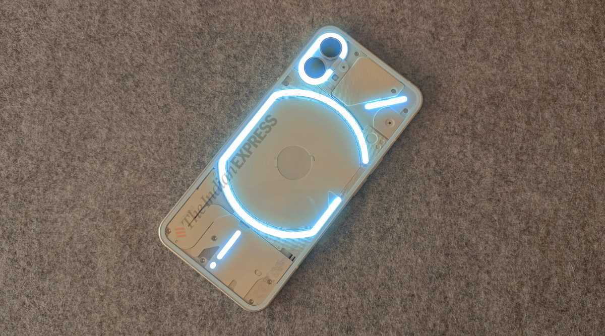
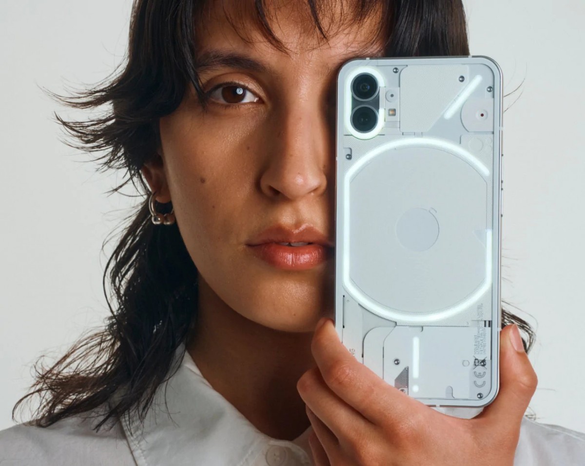
It has been three months since the launch of the Phone (1), and it is still the most stunning phone on the market. I have used both the black and white variants of the phone, and am partial to the white. That’s because the glossy glass back on the black variant practically turns the phone into a mirror, which I don’t appreciate. In contrast, the white remains the most regal and elegant-looking piece of tech on any desk I place it on.
Part of my job is to use many phones out in the open for my reviews, but rarely do I get stopped and asked about what phone I have. The last device I witnessed getting design compliments was the Realme GT Neo 3T. But the Nothing Phone (1) is in a different league altogether. From questions about what phone it is, to whether I had imported it from abroad, the Nothing Phone (1) seemed like an exotic fruit for people who don’t know about Carl Pei’s latest venture.
It also takes me back to a time of design innovation in the 2000s, when ‘smartphones’ didn’t exist, and design + form factor was the number one aspect when buying a new phone. Did we care about specifications when we had those cool, flipping and swivelling phones? Of course, these were out of reach for school-going kids like myself at the time.
What is Damage Protection Plan ?
Damage with WideCare Damage Protection Plan
The Glyph lights aren’t all that useful, yet
The Glyph lighting was made to look like the standout feature of the Nothing Phone (1). But I stopped relying on the lights to know how much the battery had charged or who was calling. This happened almost immediately since I got the phone. Instead, I use the phone’s display and brilliant yet minimal-looking Always-On Display screen for information.
That said, these glyph lights are useful in indoor and low-light photography. Does it compare to professional lighting? No. Is it a better alternative than the flash module indoors? More often than you think. The door also remains open for the Glyph lights to find more use cases with future software updates. However, they’re still on the part of the phone that faces the surface when you place your device down. I still cannot think of any implementation of the lights, which will convince me to keep my phone’s screen facing downwards.
The camera has improved with updates
The camera experience of the Nothing Phone (1) wasn’t bad, but nothing to rave about. But over the last two updates, aspects like low-light photography and consistency between the wide and ultrawide cameras have improved substantially. The phone has new features like a watermark option as well, and that is good.
We could use some more Nothing OS features
While I appreciate the clean near-stock Android implementation of Nothing OS, I must admit there are features I miss here. Coming from a OnePlus phone, the lack of features such as screen-off gestures, one-tap toggles on the quick settings, and the ability to change my lock screen clock, does make me wish the next NothingOS update will include some of these bits.
However, I wouldn’t trade the clean operating system for a feature-packed UI that spams me with ads and notifications. I would rather wait for the Nothing team to slowly bring features to the Phone (1).
What about battery life and charging?
The battery life on the Nothing Phone (1) is pretty good, and depending on usage, this can be an all-day phone for most people. I get screen-on times of anywhere between 5 to 7.5 hours on most days, depending on my usage, and that’s not bad. My phone is always connected, deals with many calls, and is paired with numerous accessories. The adaptive 120Hz is enabled the whole time as well, which impacts the battery.
The charging isn’t the fastest through. At 33W, it is still quite quick to get a full battery, much more so than many other phones in the segment that still charge at 25W. I personally don’t need much faster charging, and the wireless charging on the Nothing Phone (1) is also handy if you have a wireless charger or a wireless charging power bank like I do. But if it is simply the fastest possible charging speed you want, you may have to look elsewhere.
Verdict: Who should get the Nothing Phone (1)?
The Nothing Phone (1) is an easy one to recommend, but it isn’t for everyone. If you want a faster chipset and the best graphic settings on Android games, charging that tops up your phone in 15-20 minutes, or a feature-packed user interface that lets you customise every tiny detail, the Nothing Phone 1 is not for you. But if you’re looking for a good daily driver with above-average performance, clean, minimal software, and a stunning design that you can flaunt in public, the Nothing Phone (1) is hard to beat at its price.
News Article:- Indian Express


Recent Comments